Thursday, May 10, 2012

Original
Replica

InDesign - Magazine Duplicate

Learning InDesign was both fun and beneficial because I was able to practice what I learned from IDD 110.  I like InDesign lot and think it is a great program that I will a lot.

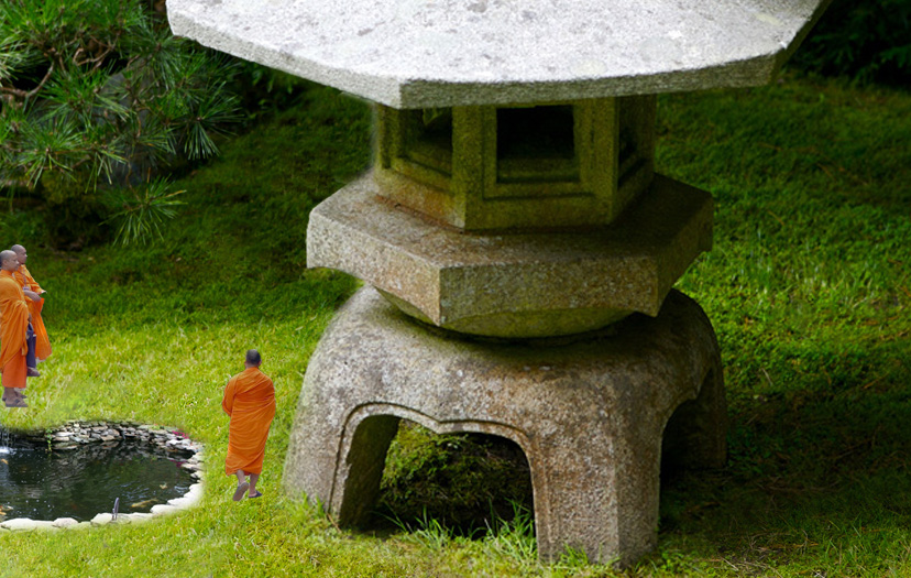
The objective in this assignment recreate and exact replica of an already existing magazine spread.  I first research magazine spreads and layouts until I found one that would be possible to replicate.  After finding my article, I then found the im ages that were used in the article, and thankfully I was able to find the exact images.  I was also able to find the exact font that they is used in the title.  I had to play around to match the correct size and placement.

Then I tried to match the pull-quote and subtitle as best as I could.  I had to make the curve of the white background so that it cut off the bottom of the image just like in the original article.  After adding the images, captions, and adjusting text placement, I completed the assignment and successfully created a replica magazine spread.

Illustrator - Live Trace

The live trace tool was an awesome tool to learn and play with because I see the effect in a lot of publications and designs and always wondered how it is created, but did not know it was that simple and easy.  I took a picture of myself, and then live traced it.  After learning the different amount of colors and effects that are used within Live Trace, I ended up with a nice piece that I think looks very cool.
Illustrator Final - Tarot Card

The Illustrator Final was to create an alphabet or Tarot Card.  I choose to do a tarot card because I though it would test my abilities a little harder. 

This was probably the most strenuous and meticulous assignment because of the detail I put into it, but I am happy with the overall result.

I started the assignment by research and gaining inspiration by looking at other Tarot Cards.  PROCURATIO means navigation or guidance, which is the over theme of my card.  I made a compass to represent that guidance.  It had wings to represent it is supernatural and spiritual, not physical guidance.  To add to the background I added a sun with a face, which is noticeable tin a lot of the cards I researched.  It is the overlooks the compass as if it was watching it.  The grass at the bottom completes the images and fives it a more full feel to it.


After making all of this in Adobe Illustrator, I exported the images to Photoshop were the real fun began.  I added multiple textures and elements to the images.  The clouds, the compass, the sun all have different textures.  On top of that I added a grainy texture to the entire card to make it look old or aged.

Overall this assignment was time consuming, but was well worth it.  I left the assignment confident in my Illustrator and Photoshop knowledge.

Illustrator to Photoshop


After learning the basics of Photoshop and Illustrator, it was then combine the two programs to create amazing graphics.
In this task, we created a graphic with shapes, and objects, surrounding Design.  It looked simple and easy in illustrator, but it was also supposed to.  After taking the graphic and transferring it to Photoshop, we learned how to add effects and textures to each layer or group of shapes.


As seen in my illustration, I have several diamonds surrounding to images, in different sizes and rotations.  After exporting the image to Photoshop, I was able to add diverse color and textures onto each individual group of diamonds.
I did the same with the other squares and circles that can be found in the graphic.  If you compare each design, you can see where the shapes are, how you can change the vector shapes, and a sample of the effects you can add to shapes once exported into Photoshop.

Illustrator - Fruit Basket

To further my Pen tool abilities, I then went on to create an entire fruit basket. By creating several other fruits, I was able to extensively practice using the pen tool and putting shapes together.  I also was able to expand my knowledge of how layers work and how to align them when I created the mesh basket.  I had to align the layers so that they look like they weave together.

Overall this assignment was very useful and pushed me to learn an essential tool that I will be use a lot in the future. 

Illustrator - Pear

The Illustrator Pear assignment was a pretty straightforward composition.  We were given the background template to create the pear and its different shapes.  This was out introduction to the Pen tool, and how to create curves, lines and connecting different shapes. 
I followed the template and create the pear and its shapes, put them together all together and made it look nice.  I added a slight gradient to show light reflecting off it.
 
Illustrator - 9 Squares

Much like the pear assignment, the 9 Squares assignment was a composition that pushed me to learn many aspects of Adobe Illustrator and I am now grateful for doing it because I now have a better understand of many of the tool and aspects of the program as a whole.

The objective was to create 9 different, simple designs of everyday objects or things.  I decided to create a Gameboy, a football, a hotdog, flowers, a fish, an eye, and anchor and buoy, a ball, and a duck.

Each of these images was diverse in how I create them.  For example, the duck I focused on using the pen tool that I had just learned how to use but the fish is made up of most shapes on top of each other.

The challenging part of this assignment was working with the Pathfinder window.  Merging, Dividing, and Uniting paths was hard to learn, but again, I leave the assignment with a much better understand of how to use it.
 

Illustrator - The Color Wheel

The Color Wheel assignment was an objective that combined two major aspects o Illustrator and design, basic shapes and color theory.  While accomplishing this composition, I was able to learn about colors, the differences between CMYK and RGB, and how to use the color sliders in Illustrator.  While it may seem like a simple assignment, the value of doing it was much greater than the time spent on it. 

I then took the basic color wheel that I made, and tried to make a cool image.  I took parts of the wheel, separated them, and played around and used various filter effects to change the shape and figure of each section.
Exploring the different filter effects was beneficial because it learned that Adobe Illustrator can alter images and shapes on its own, which would save me time from manually doing it to recreate the same effect.

Illustrator - Pencil

This assignment was our first experience with Adobe Illustrator. In this composition, we made just a regular pencil.  We made it by scaling down shapes, adding them on top of each other, and adding slight gradients also. 

After learning the basics of Illustrator, I went on and furthered the images.  I created paper, a ruler, and a textbook.  This being our first time using Illustrator, it is very basic.  However through doing this assignment and several of the other Illustrator assignments, I was able to further my knowledge of the program and learned about layers, shapes, gradients, different adjustments.

Photoshop Final - Muse CD Cover

For my Photoshop final, I decided to create a CD Booklet for the band Muse.  I used many tools in the making of this final.  First I took the cover photo from online and added the curved texture in to add to it.  On the back I took and other image from a concert, logos that are typically fond on disc cases.  I think it looks very professional and would be a booklet that would be similar to any of the current ones.
Zen Retouch

The Zen retouch piece was harder to do because I couldn’t think of what to add to the image.  After fixing the grass, I decided to continue the “Zen vibe” and a monks and a Coy pond.  I had to alter their perspective so that it looked more realistic.  By making them smaller, the once small lighthouse now seems larger as if it is a watchtower or something of that nature.

Cliff Retouch

The cliff piece was also challenging to expand and add too.  First things I did was fix the cliff on the left side and removed the imperfections.  A added a hand reaching down that the girl could reach up to.  Then I added another rock climber, and a man holding a climbing rope.  Both the addition men I had to alter there brightness and contrast to make them seem like they fit into the image better.  Drop Shadows were added to both to mimic the shadow that is cast, evident when looking at the girl. 

Crew Retouch

The backdrop of this retouching image is the Boston Harbor and skyline.  I took the rowers from the original image and selected only what I wanted from the crew and moved it into the background.  This assignment tested me because I had to work very zoomed in on the image to properly select the right pixels.
Photoshop - Retouching

We learned about layer mask shortly into our introduction into Adobe Photoshop.  Layer mask hide parts of images, so that several can be places together and made to look like a collage effect. 

For my two compositions, I made one about Deadmau5, the music artist, and one about the beach.  Deadmau5 is a techno DJ, so I made an image that would represent all the aspects of one of his concerts.  I had images of a crowd, a DJ booth, his logo, and a turntable.  In my second piece, the beach themed one, I tried to give off a summer beach vibe.  I had a surfer, starfish, waves, and clear blue water.  This was harder than the first piece because there was a lot of white, in several shades too, so it was hard playing around with the layer masks to make the work look nice.


Window Retouch

The Window piece is an altered image in several ways.  First, the color of the building was changed to yellow.  The flowers remain the same and so do the shutters.  Then I took an image from the movie Disturbia, which is about a boy who is under house arrest and looks at the world outside from his Binoculars.  I put the image behind the curtains, and then transformed the curtains to show the face. 


Photoshop - Layer Mask

We learned about layer mask shortly into our introduction into Adobe Photoshop.  Layer mask hide parts of images, so that several can be places together and made to look like a collage effect. 

For my two compositions, I made one about Deadmau5, the music artist, and one about the beach.  Deadmau5 is a techno DJ, so I made an image that would represent all the aspects of one of his concerts.  I had images of a crowd, a DJ booth, his logo, and a turntable.  In my second piece, the beach themed one, I tried to give off a summer beach vibe.  I had a surfer, starfish, waves, and clear blue water.  This was harder than the first piece because there was a lot of white, in several shades too, so it was hard playing around with the layer masks to make the work look nice.


Photoshop - Selections

This is the second assignment and the purpose of this was to practice with selecting images and being able to successfully and properly select various shapes and sizes.  All of the items in this image have been taken from another outside image and place into positions.  I tried to portray different aspects that people consider ‘The American Dream’, and compile then into one work.  Stereotypical and average American type things like football, baseball, beer, money, cars, school, hamburger, and a house.

The second selection piece is based off of the Occupy Wall Street Movement.  I wanted to represent the general feelings of the people involved which include; passion and angry represented by the fire, the various government agencies involved, money representing greed, Guy Fawkes mask to represent rebellion, and the fist to represent stand up for what your believe.

Photoshop - Avatar

This is an altered self portrait that I changed to look like the Na'vi from Avatar.  I thought that I was able to transform my regular self image into this character.  I added skin texture, changed the skin and lips color, added the face stripe design from another texture, and had to change my ears also.